Tailwind CSS v4 has been stable since early 2026 and is now the default across the ecosystem. create-next-app installs it automatically. npx shadcn@latest init configures it out of the box. If you're starting a new project, you're using v4 whether you realize it or not.
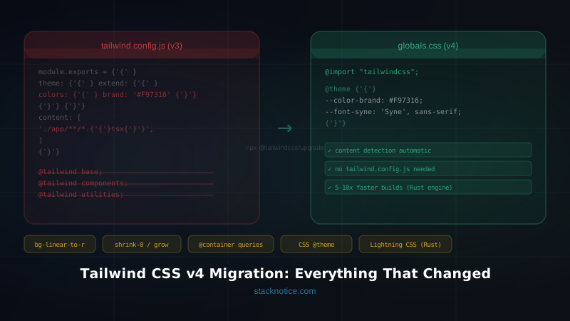
What changed is significant: the JavaScript config file is gone, the PostCSS plugin was replaced, a handful of class names were renamed, and the CSS engine was rebuilt in Rust. The result is builds that are 5–10x faster and a configuration model that's cleaner than a JavaScript file ever was.
This guide covers two things: how to migrate an existing v3 project without breaking it, and how to configure v4 correctly in new projects using the current tooling defaults.
What's Actually Different in v4
Three fundamental changes drive everything else:
1. The engine is Rust, not Node. Lightning CSS replaced the PostCSS-based pipeline. Cold builds that took 3–5 seconds on large projects now take under a second. Incremental rebuilds are in the microsecond range — fast enough that you never notice the CSS step.
2. Config moved from JavaScript to CSS. tailwind.config.js is gone. Design tokens (colors, spacing, fonts, breakpoints) now live in a @theme block in your CSS file. This is actually cleaner — your design system lives alongside the CSS it produces, and you can read the values directly without opening a separate file.
3. Content detection is automatic. No more content: ['./app/**/*.{js,ts,jsx,tsx}'] arrays. Tailwind v4 scans your project root and finds class names automatically.
Browser support minimum: Safari 16.4+, Chrome 111+, Firefox 128+. These cover 98%+ of current traffic. If you have a specific requirement for older Safari, stay on v3.4 for that project.
New Project Setup
If you're starting fresh with Next.js 15, Tailwind v4 is already installed:
npx create-next-app@latest my-appThe generated postcss.config.mjs:
const config = {
  plugins: {
    '@tailwindcss/postcss': {},
  },
}
export default config
The generated app/globals.css:
@import "tailwindcss";That's the entire setup. No tailwind.config.ts, no content arrays, no @tailwind directives.
To add custom design tokens, you add a @theme block to your CSS file:
@import "tailwindcss";

@theme {
  --color-brand: #F97316;
  --color-surface: #0D1117;
  --color-surface-elevated: #161B22;
  --font-sans: 'Inter', sans-serif;
  --font-mono: 'JetBrains Mono', monospace;
  --radius-card: 0.75rem;
}
These CSS custom properties become Tailwind utilities automatically — bg-brand, text-brand, font-sans, rounded-card. You don't register them anywhere else.
Vite setup
For Vite projects, use the dedicated plugin instead of PostCSS:
npm install --save-dev @tailwindcss/vite// vite.config.ts
import { defineConfig } from 'vite'
import react from '@vitejs/plugin-react'
import tailwindcss from '@tailwindcss/vite'
export default defineConfig({
plugins: [
tailwindcss(),
react(),
],
})The Vite plugin is faster than the PostCSS path because it hooks into Vite's module graph directly.
shadcn/ui v4
shadcn/ui v2 (released alongside Tailwind v4) is built on Tailwind v4 natively. Running npx shadcn@latest init now:
- Installs
tailwindcss@latestand@tailwindcss/postcss - Configures
@import "tailwindcss"in your CSS - Adds the color system using
@theme inlineand CSS variables — no JavaScript config
The component styles use CSS variables for theming:
/* generated by shadcn init */
@theme inline {
  --color-background: var(--background);
  --color-foreground: var(--foreground);
  --color-primary: var(--primary);
  --color-primary-foreground: var(--primary-foreground);
  /* ... */
}

:root {
  --background: oklch(1 0 0);
  --foreground: oklch(0.145 0 0);
  --primary: oklch(0.205 0 0);
  /* ... */
}

.dark {
  --background: oklch(0.145 0 0);
  --foreground: oklch(0.985 0 0);
  /* ... */
}
If you're using shadcn and upgrading to v4, run npx shadcn@latest init to get the new config. The component code itself doesn't change — just the underlying config model.
Migrating from v3
The official upgrade tool handles ~90% of the mechanical changes:
git checkout -b tailwind-v4-migration
npx @tailwindcss/upgrade
git diff  # review before committing
The tool converts your tailwind.config.js to @theme blocks, replaces @tailwind directives with @import "tailwindcss", updates the PostCSS config, and renames changed classes. Review the diff carefully — especially for custom plugins.
The remaining 10% you'll handle manually.
Breaking change: no more tailwind.config.js
Before:
// tailwind.config.js
module.exports = {
  theme: {
    extend: {
      colors: {
        brand: '#F97316',
        surface: '#0D1117',
      },
      fontFamily: {
        syne: ['Syne', 'sans-serif'],
      },
    },
  },
}
After — same tokens, in CSS:
@import "tailwindcss";

@theme {
  --color-brand: #F97316;
  --color-surface: #0D1117;
  --font-syne: 'Syne', sans-serif;
}
The utilities work identically: bg-brand, text-surface, font-syne.
What the migration tool won't automatically convert: custom plugins written as JavaScript functions. If you have a plugins: [...] array with custom utilities or components, you'll need to rewrite those as @layer utilities or @layer components blocks in CSS.
Breaking change: @tailwind directives removed
Before:
@tailwind base;
@tailwind components;
@tailwind utilities;
After:
@import "tailwindcss";The migration tool replaces this automatically.
Breaking change: default border color changed
In v3, border without a color defaulted to gray-200. In v4 it defaults to currentColor.
Every element in your project using border, divide, or outline without an explicit color will look different. The migration tool can't detect these reliably because the visual impact depends on context.
Fix 1 — add explicit colors where it matters:
<!-- v3: gray-200 implicitly -->
<div class="border">...</div>

<!-- v4: explicit -->
<div class="border border-gray-200">...</div>
Fix 2 — restore the v3 default globally:
@import "tailwindcss";

@theme {
  --default-border-color: var(--color-gray-200);
}
Breaking change: ring default width changed from 3px to 1px
<!-- v3 behavior: 3px ring -->
<button class="ring">...</button>

<!-- v4 equivalent -->
<button class="ring-3">...</button>
Class renames
The migration tool handles all of these, but good to know for code reviews:
| v3 | v4 |
|---|---|
bg-gradient-to-r | bg-linear-to-r |
bg-gradient-to-l | bg-linear-to-l |
bg-gradient-to-t | bg-linear-to-t |
bg-gradient-to-b | bg-linear-to-b |
flex-shrink-0 | shrink-0 |
flex-shrink | shrink |
flex-grow-0 | grow-0 |
flex-grow | grow |
overflow-ellipsis | text-ellipsis |
decoration-clone | box-decoration-clone |
New Capabilities in v4
Container queries — no plugin needed
Container queries let a component respond to its container's size rather than the viewport:
<div class="@container">
  <div class="grid-cols-1 @sm:grid-cols-2 @lg:grid-cols-4">
    <!-- layout changes based on container width, not screen width -->
  </div>
</div>
In v3, this required the @tailwindcss/container-queries plugin. In v4 it's built-in.
Continuous spacing scale
In v3, w-37 didn't exist — you had to write w-[37px]. In v4, the spacing scale is continuous:
<div class="w-37 h-13 mt-11">...</div>Any numeric value works directly. The [...] arbitrary syntax is still there for non-standard values, but you need it less often.
3D transforms
<div class="rotate-x-15 rotate-y-12 perspective-500">
  <!-- 3D card effect -->
</div>rotate-x-*, rotate-y-*, scale-z-*, translate-z-*, perspective-* are all built-in now.
@starting-style for entry animations
CSS @starting-style enables true enter/exit animations without JavaScript. Tailwind v4 exposes this directly:
@layer utilities {
  .animate-enter {
    opacity: 1;
    transform: translateY(0);
    transition: opacity 0.2s, transform 0.2s;

    @starting-style {
      opacity: 0;
      transform: translateY(-8px);
    }
  }
}
Dynamic values with data-* variants
<div data-size="large" class="data-[size=large]:text-xl data-[size=large]:p-8">
  ...
</div>
Migration Checklist
[ ] git checkout -b tailwind-v4-migration
[ ] npm install tailwindcss@latest @tailwindcss/postcss
[ ] npx @tailwindcss/upgrade  (review diff carefully)

Manual checks after the tool:
[ ] Remove tailwind.config.js (migrated to @theme)
[ ] Check border/divide/outline utilities — explicit colors now required
[ ] Check ring utilities — default changed to 1px
[ ] Search for bg-gradient-to-* → bg-linear-to-* (if tool missed any)
[ ] Search for flex-shrink/flex-grow → shrink/grow (if tool missed any)
[ ] Convert any custom JavaScript plugins to @layer blocks
[ ] Visual review in Safari 16.4+, Chrome, Firefox
[ ] Run your test suite
[ ] Merge and deploy
Working with v4 Day-to-Day
A few patterns to internalize for new code:
Custom tokens go in @theme, not a JS file:
@theme {
  --color-primary: oklch(65% 0.2 250);
  --color-primary-hover: oklch(60% 0.22 250);
  --spacing-section: 6rem;
  --shadow-card: 0 2px 8px 0 rgb(0 0 0 / 0.12);
}
Arbitrary variants without plugins:
<div class="[&>p]:text-gray-600 [&>p]:leading-relaxed">
  <!-- targets all direct p children -->
</div>
Include external packages that need scanning:
@import "tailwindcss";
@source "../node_modules/@your-org/ui-components";
Useful when using internal design system packages — Tailwind v4 won't scan node_modules by default.
Tailwind v4 is a better version of the same idea. The Rust engine makes builds fast enough to be invisible. The CSS config is more readable than a JavaScript object. Container queries and 3D transforms being built-in removes two common plugin dependencies.
For new projects, it's the default — nothing to think about. For existing v3 projects, the upgrade tool does most of the work. Spend an afternoon, run the checklist, and you're on the current tool.
For component library setup on top of Tailwind v4, see the best Tailwind UI libraries for 2026. For the full stack setup with Next.js 15, Drizzle, and Better Auth, see the full-stack TypeScript project setup guide.