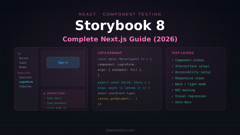
The gap between writing a component and being confident it works across all its states — loading, empty, error, mobile, dark mode — is where most UI bugs live. Storybook 8 closes that gap by letting you develop and test components in complete isolation, with first-class support for Next.js App Router and React Server Components built in.
This guide covers everything from initial setup through interaction testing, provider decorators, RSC mocking, and visual regression in CI.
Installation with Next.js
npx storybook@latest initThe init command detects Next.js automatically and installs @storybook/nextjs — an adapter that handles Next.js-specific concerns: next/image, next/link, next/navigation hooks, environment variables, and static file serving. No manual configuration required for most projects.
After installation you get:
.storybook/main.ts— framework config and addons.storybook/preview.ts— global decorators and parameters- Example stories in
src/stories/
Start the dev server:
npm run storybookStory Format: CSF3
Stories use Component Story Format 3 (CSF3). Each story is a named export from a file ending in .stories.tsx:
// components/ui/Button.stories.tsx
import type { Meta, StoryObj } from '@storybook/react'
import { Button } from './Button'

const meta: Meta<typeof Button> = {
  title: 'UI/Button',
  component: Button,
  tags: ['autodocs'],  // generates documentation page automatically
  args: {
    children: 'Click me',  // shared default across all stories
  },
  argTypes: {
    variant: {
      control: 'select',
      options: ['default', 'destructive', 'outline', 'ghost'],
    },
    size: {
      control: 'radio',
      options: ['sm', 'default', 'lg'],
    },
    disabled: {
      control: 'boolean',
    },
  },
}

export default meta
type Story = StoryObj<typeof Button>

export const Default: Story = {}

export const Destructive: Story = {
  args: { variant: 'destructive', children: 'Delete account' },
}

export const Loading: Story = {
  args: { disabled: true, children: 'Saving...' },
}

export const IconWithLabel: Story = {
  args: {
    children: (
      <>
        <PlusCircle className="mr-2 h-4 w-4" />
        Add item
      </>
    ),
  },
}
args defines the props. argTypes controls how the Storybook UI lets you interact with them — dropdowns, toggles, text inputs in the controls panel.
Decorators: Wrapping Stories with Providers
Real components need context — theme, auth session, React Query client, toast provider. Decorators wrap every story in your providers:
// .storybook/preview.ts
import type { Preview } from '@storybook/react'
import { ThemeProvider } from '../src/components/theme-provider'
import { QueryClient, QueryClientProvider } from '@tanstack/react-query'
import { Toaster } from '../src/components/ui/sonner'
import '../src/app/globals.css'

const queryClient = new QueryClient({
  defaultOptions: { queries: { retry: false } },
})

const preview: Preview = {
  decorators: [
    (Story) => (
      <QueryClientProvider client={queryClient}>
        <ThemeProvider defaultTheme="dark">
          <Story />
          <Toaster />
        </ThemeProvider>
      </QueryClientProvider>
    ),
  ],
  parameters: {
    backgrounds: {
      default: 'dark',
      values: [
        { name: 'dark', value: '#0D1117' },
        { name: 'light', value: '#ffffff' },
      ],
    },
    layout: 'centered',
  },
}

export default preview
You can also add decorators per-story or per-component:
// Component-level decorator (only this component's stories)
const meta: Meta<typeof UserCard> = {
  decorators: [
    (Story) => (
      <div className="p-8 max-w-sm">
        <Story />
      </div>
    ),
  ],
}

// Story-level decorator (only this story)
export const InSidebar: Story = {
  decorators: [
    (Story) => (
      <div className="w-64 bg-sidebar p-4">
        <Story />
      </div>
    ),
  ],
}
The play Function: Interaction Testing
The play function runs after a story renders. It simulates user interactions and asserts on the result — without a separate test file:
// components/forms/LoginForm.stories.tsx
import type { Meta, StoryObj } from '@storybook/react'
import { expect, userEvent, within, fn } from '@storybook/test'
import { LoginForm } from './LoginForm'

const meta: Meta<typeof LoginForm> = {
  component: LoginForm,
  args: {
    onSubmit: fn(),  // a tracked mock function
  },
}

export default meta
type Story = StoryObj<typeof LoginForm>

export const ValidSubmission: Story = {
  play: async ({ canvasElement, args }) => {
    const canvas = within(canvasElement)

    // Find and fill the email input
    await userEvent.type(
      canvas.getByLabelText('Email'),
      'alice@example.com'
    )

    // Fill the password input
    await userEvent.type(
      canvas.getByLabelText('Password'),
      'correcthorse'
    )

    // Submit the form
    await userEvent.click(canvas.getByRole('button', { name: /sign in/i }))

    // Assert the onSubmit handler was called with the right data
    await expect(args.onSubmit).toHaveBeenCalledWith({
      email: 'alice@example.com',
      password: 'correcthorse',
    })
  },
}

export const ValidationErrors: Story = {
  play: async ({ canvasElement }) => {
    const canvas = within(canvasElement)

    // Submit without filling anything
    await userEvent.click(canvas.getByRole('button', { name: /sign in/i }))

    // Assert validation messages appear
    await expect(canvas.getByText('Email is required')).toBeInTheDocument()
    await expect(canvas.getByText('Password is required')).toBeInTheDocument()
  },
}

export const InvalidEmail: Story = {
  play: async ({ canvasElement }) => {
    const canvas = within(canvasElement)

    await userEvent.type(canvas.getByLabelText('Email'), 'not-an-email')
    await userEvent.tab()  // trigger blur validation

    await expect(
      canvas.getByText('Please enter a valid email address')
    ).toBeInTheDocument()
  },
}
You watch these interactions run live in the Storybook UI. In CI, the Storybook test runner executes them headlessly.
Running Interaction Tests in CI
# Install the test runner
npm install --save-dev @storybook/test-runner

# Add to package.json scripts:
# "test-storybook": "test-storybook"
# .github/workflows/storybook.yml
- name: Build Storybook
run: npm run build-storybook
- name: Serve Storybook and run tests
run: |
npx concurrently -k -s first -n "SB,TEST" -c "magenta,blue" \
"npx http-server storybook-static --port 6006 --silent" \
"npx wait-on tcp:6006 && npm run test-storybook"Mocking Next.js Navigation
@storybook/nextjs mocks next/navigation hooks automatically, but you need to configure the mock values for stories that read them:
// components/nav/Breadcrumb.stories.tsx
import type { Meta, StoryObj } from '@storybook/react'
import { Breadcrumb } from './Breadcrumb'

const meta: Meta<typeof Breadcrumb> = {
  component: Breadcrumb,
  parameters: {
    nextjs: {
      // Mock the App Router context
      appDirectory: true,
      navigation: {
        pathname: '/dashboard/users',
        segments: [['dashboard', ''], ['users', '']],
      },
    },
  },
}

export default meta
type Story = StoryObj<typeof Breadcrumb>

export const UsersPage: Story = {}

export const NestedPage: Story = {
  parameters: {
    nextjs: {
      navigation: {
        pathname: '/dashboard/users/123/edit',
      },
    },
  },
}
For useRouter, useParams, useSearchParams — all available through the same parameters.nextjs.navigation config.
Mocking Server Actions and API Calls
Use fn() from @storybook/test to mock server actions passed as props:
// components/todos/TodoItem.stories.tsx
import { fn } from '@storybook/test'
import { TodoItem } from './TodoItem'

export default {
  component: TodoItem,
  args: {
    onToggle: fn(),
    onDelete: fn(),
  },
}

export const Completed: Story = {
  args: {
    todo: { id: '1', title: 'Write Storybook stories', completed: true },
  },
}

export const DeleteFlow: Story = {
  args: {
    todo: { id: '1', title: 'Old task', completed: false },
  },
  play: async ({ canvasElement, args }) => {
    const canvas = within(canvasElement)
    await userEvent.click(canvas.getByRole('button', { name: /delete/i }))
    await expect(args.onDelete).toHaveBeenCalledWith('1')
  },
}
For components that call a server action directly (not via prop), mock the module:
// The component imports the action directly
import { deleteTodo } from '@/actions/todos'

// In the story file:
import { deleteTodo } from '@/actions/todos'
import { fn } from '@storybook/test'

// Mock the entire module
export default {
  component: TodoItem,
  beforeEach() {
    // Reset mock between stories
    (deleteTodo as ReturnType<typeof fn>).mockResolvedValue({ success: true })
  },
}
Configure the mock in .storybook/main.ts:
// .storybook/main.ts
const config: StorybookConfig = {
  framework: '@storybook/nextjs',
  stories: ['../src/**/*.stories.@(js|jsx|ts|tsx)'],
  addons: ['@storybook/addon-essentials', '@storybook/addon-interactions'],
  // Enable module mocking
  experimental_indexers: [],
}
React Server Component Stories
Storybook 8 can render RSCs by mocking the server modules they depend on:
// components/UserProfile.tsx (Server Component)
import { db } from '@/lib/db'
import { auth } from '@/lib/auth'

export async function UserProfile({ userId }: { userId: string }) {
  const user = await db.query.users.findFirst({ where: eq(users.id, userId) })
  return <div>{user?.name}</div>
}
// components/UserProfile.stories.tsx
import type { Meta, StoryObj } from '@storybook/react'
import { UserProfile } from './UserProfile'
// Mock the server modules
vi.mock('@/lib/db', () => ({
db: {
query: {
users: {
findFirst: vi.fn(),
},
},
},
}))
const meta: Meta<typeof UserProfile> = {
component: UserProfile,
}
export default meta
type Story = StoryObj<typeof UserProfile>
export const WithUser: Story = {
args: { userId: 'user_123' },
beforeEach() {
const { db } = require('@/lib/db')
db.query.users.findFirst.mockResolvedValue({
id: 'user_123',
name: 'Alice Chen',
email: 'alice@example.com',
})
},
}
export const UserNotFound: Story = {
args: { userId: 'unknown' },
beforeEach() {
const { db } = require('@/lib/db')
db.query.users.findFirst.mockResolvedValue(null)
},
}Viewport Testing
Test responsive behavior without resizing your browser window:
export const Mobile: Story = {
  parameters: {
    viewport: {
      defaultViewport: 'mobile1',  // 320px
    },
  },
}

export const Tablet: Story = {
  parameters: {
    viewport: {
      defaultViewport: 'tablet',  // 768px
    },
  },
}
Define custom viewports in preview.ts:
parameters: {
  viewport: {
    viewports: {
      dashboardSidebar: { name: 'Dashboard sidebar', styles: { width: '260px', height: '900px' } },
      productCard: { name: 'Product grid card', styles: { width: '320px', height: '480px' } },
    },
  },
},
Accessibility Testing
The a11y addon runs axe on every story automatically:
npm install --save-dev @storybook/addon-a11y// .storybook/main.ts
addons: ['@storybook/addon-essentials', '@storybook/addon-a11y'],Now every story has an Accessibility tab showing violations. You can also assert on it in play:
import { checkA11y } from '@storybook/addon-a11y'

export const AccessibleForm: Story = {
  play: async ({ canvasElement }) => {
    // ... render and interact
    await checkA11y(canvasElement)
  },
}
Organizing Stories at Scale
For a large component library, folder structure matters:
src/
  components/
    ui/
      Button.stories.tsx
      Input.stories.tsx
      Modal.stories.tsx
    features/
      users/
        UserCard.stories.tsx
        UserTable.stories.tsx
      billing/
        PlanCard.stories.tsx
        InvoiceRow.stories.tsx
Use the title field in meta to group them in the sidebar:
// Groups under "Features/Users/"
const meta: Meta<typeof UserCard> = {
  title: 'Features/Users/UserCard',
  component: UserCard,
}

// Groups under "UI/"
const meta: Meta<typeof Button> = {
  title: 'UI/Button',
  component: Button,
  tags: ['autodocs'],
}
The autodocs tag generates a documentation page with all stories, controls, and prop types automatically.
Quick Reference
// .storybook/main.ts — Next.js framework
framework: '@storybook/nextjs'

// Story structure
const meta: Meta<typeof Component> = {
  component: Component,
  tags: ['autodocs'],
  args: { /* shared defaults */ },
  argTypes: { variant: { control: 'select', options: [...] } },
  decorators: [(Story) => <Provider><Story /></Provider>],
}
export default meta
type Story = StoryObj<typeof Component>
export const MyStory: Story = { args: { ... } }

// play function
play: async ({ canvasElement, args }) => {
  const canvas = within(canvasElement)
  await userEvent.type(canvas.getByLabelText('Email'), 'test@test.com')
  await userEvent.click(canvas.getByRole('button', { name: /submit/i }))
  await expect(args.onSubmit).toHaveBeenCalled()
}

// Next.js navigation mock
parameters: { nextjs: { navigation: { pathname: '/dashboard' } } }

// Mock functions
args: { onSubmit: fn() }  // fn() from '@storybook/test'

// Run tests
npx test-storybook
The workflow that earns its keep: for every component, write stories for the empty state, loading state, error state, and the main success state before writing the component itself. It forces you to think through all the edge cases up front, and you get free visual regression tests as a side effect. Pairs well with Vitest + Playwright for the layers of testing that Storybook doesn't cover — integration tests, API routes, and full E2E flows.