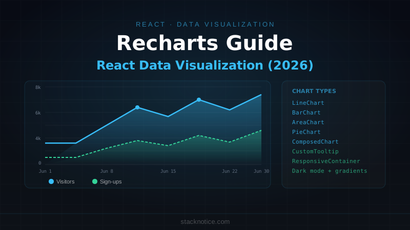
Chart libraries for React split into two categories: those that are React-native (data flows in as props, components compose naturally) and those ported from JavaScript that fight React's model. Recharts is in the first category — built on top of SVG and D3, but exposed as React components you compose together.
This guide covers every chart type and pattern you'd actually need in a dashboard or analytics interface: time-series lines, comparison bars, trend areas, distributions, custom tooltips, dark mode, and real data shapes.
Installation
npm install rechartsimport {
LineChart, BarChart, AreaChart, PieChart,
Line, Bar, Area, Pie, Cell,
XAxis, YAxis, CartesianGrid, Tooltip, Legend,
ResponsiveContainer,
} from 'recharts'ResponsiveContainer: Always Use It
Never hardcode width and height on chart components directly. ResponsiveContainer makes charts fill their container and reflow on resize:
// ❌ Fixed size — breaks in sidebars, modals, responsive layouts
<LineChart width={600} height={300} data={data} />

// ✅ Fills container, adapts to screen size
<ResponsiveContainer width="100%" height={300}>
  <LineChart data={data}>
    {/* ... */}
  </LineChart>
</ResponsiveContainer>
Line Chart: Time Series Data
The workhorse of analytics dashboards:
type DailyMetric = {
  date: string      // "2026-06-01"
  visitors: number
  signups: number
  revenue: number
}

function VisitorsChart({ data }: { data: DailyMetric[] }) {
  return (
    <ResponsiveContainer width="100%" height={300}>
      <LineChart data={data} margin={{ top: 5, right: 20, left: 0, bottom: 5 }}>
        <CartesianGrid strokeDasharray="3 3" stroke="rgba(255,255,255,0.06)" />
        <XAxis
          dataKey="date"
          tick={{ fontSize: 12, fill: '#94a3b8' }}
          tickFormatter={(value) => new Date(value).toLocaleDateString('en', { month: 'short', day: 'numeric' })}
          axisLine={false}
          tickLine={false}
        />
        <YAxis
          tick={{ fontSize: 12, fill: '#94a3b8' }}
          axisLine={false}
          tickLine={false}
          tickFormatter={(value) => value >= 1000 ? `${(value / 1000).toFixed(1)}k` : value}
        />
        <Tooltip content={<CustomTooltip />} />
        <Legend wrapperStyle={{ fontSize: 13, paddingTop: 16 }} />

        <Line
          type="monotone"
          dataKey="visitors"
          stroke="#38BDF8"
          strokeWidth={2}
          dot={false}
          activeDot={{ r: 5, strokeWidth: 0 }}
          name="Visitors"
        />
        <Line
          type="monotone"
          dataKey="signups"
          stroke="#34D399"
          strokeWidth={2}
          dot={false}
          activeDot={{ r: 5, strokeWidth: 0 }}
          name="Sign-ups"
        />
      </LineChart>
    </ResponsiveContainer>
  )
}
type="monotone" gives you smooth curves. type="linear" gives straight lines between points. type="step" is useful for state transitions.
Custom Tooltip
The default tooltip is functional but ugly. A custom tooltip matches your design system:
import { TooltipProps } from 'recharts'

function CustomTooltip({ active, payload, label }: TooltipProps<number, string>) {
  if (!active || !payload?.length) return null

  return (
    <div className="rounded-lg border border-border bg-card px-3 py-2 shadow-lg">
      <p className="mb-2 text-xs text-muted-foreground">
        {new Date(label).toLocaleDateString('en', {
          weekday: 'short', month: 'short', day: 'numeric',
        })}
      </p>
      {payload.map((entry) => (
        <div key={entry.dataKey} className="flex items-center gap-2 text-sm">
          <span
            className="inline-block h-2 w-2 rounded-full"
            style={{ backgroundColor: entry.color }}
          />
          <span className="text-muted-foreground">{entry.name}:</span>
          <span className="font-medium tabular-nums">
            {typeof entry.value === 'number'
              ? entry.value.toLocaleString()
              : entry.value}
          </span>
        </div>
      ))}
    </div>
  )
}
Bar Chart: Comparisons
type CategoryRevenue = {
  category: string
  current: number
  previous: number
}

function RevenueComparison({ data }: { data: CategoryRevenue[] }) {
  return (
    <ResponsiveContainer width="100%" height={280}>
      <BarChart data={data} barCategoryGap="25%" barGap={4}>
        <CartesianGrid strokeDasharray="3 3" vertical={false} stroke="rgba(255,255,255,0.06)" />
        <XAxis dataKey="category" tick={{ fontSize: 12, fill: '#94a3b8' }} axisLine={false} tickLine={false} />
        <YAxis
          tick={{ fontSize: 12, fill: '#94a3b8' }}
          axisLine={false}
          tickLine={false}
          tickFormatter={(v) => `$${(v / 1000).toFixed(0)}k`}
        />
        <Tooltip content={<CustomTooltip />} cursor={{ fill: 'rgba(255,255,255,0.04)' }} />
        <Legend wrapperStyle={{ fontSize: 13, paddingTop: 12 }} />

        <Bar dataKey="previous" fill="#334155" radius={[4, 4, 0, 0]} name="Last month" />
        <Bar dataKey="current" fill="#38BDF8" radius={[4, 4, 0, 0]} name="This month" />
      </BarChart>
    </ResponsiveContainer>
  )
}
radius={[4, 4, 0, 0]} rounds the top corners. barCategoryGap controls spacing between groups, barGap between bars within a group.
Horizontal bar chart
import { BarChart, Bar, XAxis, YAxis } from 'recharts'

// layout="vertical" flips the axes
<BarChart layout="vertical" data={data}>
  <XAxis type="number" tick={{ fontSize: 12 }} tickFormatter={(v) => `${v}%`} />
  <YAxis type="category" dataKey="name" width={100} tick={{ fontSize: 12 }} />
  <Bar dataKey="value" fill="#38BDF8" radius={[0, 4, 4, 0]} />
</BarChart>
Area Chart: Trends with Fill
Area charts work well for cumulative metrics or when you want to emphasize the volume under the curve:
function RevenueAreaChart({ data }: { data: DailyMetric[] }) {
  return (
    <ResponsiveContainer width="100%" height={250}>
      <AreaChart data={data} margin={{ top: 10, right: 10, left: 0, bottom: 0 }}>
        <defs>
          {/* Gradient fill — fades from color to transparent */}
          <linearGradient id="revenueGradient" x1="0" y1="0" x2="0" y2="1">
            <stop offset="5%" stopColor="#38BDF8" stopOpacity={0.3} />
            <stop offset="95%" stopColor="#38BDF8" stopOpacity={0} />
          </linearGradient>
        </defs>
        <CartesianGrid strokeDasharray="3 3" stroke="rgba(255,255,255,0.06)" vertical={false} />
        <XAxis dataKey="date" tick={{ fontSize: 12, fill: '#94a3b8' }} axisLine={false} tickLine={false}
          tickFormatter={(v) => new Date(v).toLocaleDateString('en', { month: 'short', day: 'numeric' })} />
        <YAxis tick={{ fontSize: 12, fill: '#94a3b8' }} axisLine={false} tickLine={false}
          tickFormatter={(v) => `$${(v / 1000).toFixed(0)}k`} />
        <Tooltip content={<CustomTooltip />} />
        <Area
          type="monotone"
          dataKey="revenue"
          stroke="#38BDF8"
          strokeWidth={2}
          fill="url(#revenueGradient)"
          dot={false}
        />
      </AreaChart>
    </ResponsiveContainer>
  )
}
Stacked area chart
<AreaChart data={data} stackOffset="expand">
  <Area type="monotone" dataKey="organic" stackId="1" stroke="#38BDF8" fill="#38BDF8" fillOpacity={0.4} />
  <Area type="monotone" dataKey="paid" stackId="1" stroke="#F472B6" fill="#F472B6" fillOpacity={0.4} />
  <Area type="monotone" dataKey="direct" stackId="1" stroke="#34D399" fill="#34D399" fillOpacity={0.4} />
</AreaChart>
stackOffset="expand" normalizes to 100% (like a percentage stacked chart).
Pie Chart: Distributions
type ChannelData = { name: string; value: number; color: string }

const COLORS = ['#38BDF8', '#34D399', '#F472B6', '#FBBF24', '#A78BFA']

function TrafficSourcePie({ data }: { data: ChannelData[] }) {
  const total = data.reduce((sum, d) => sum + d.value, 0)

  return (
    <ResponsiveContainer width="100%" height={260}>
      <PieChart>
        <Pie
          data={data}
          cx="50%"
          cy="50%"
          innerRadius={70}    // donut chart — remove for filled pie
          outerRadius={110}
          paddingAngle={3}
          dataKey="value"
          stroke="none"
        >
          {data.map((entry, index) => (
            <Cell key={entry.name} fill={COLORS[index % COLORS.length]} />
          ))}
        </Pie>
        <Tooltip
          content={({ active, payload }) => {
            if (!active || !payload?.length) return null
            const item = payload[0]
            return (
              <div className="rounded-lg border bg-card px-3 py-2 shadow-lg">
                <p className="font-medium">{item.name}</p>
                <p className="text-sm text-muted-foreground">
                  {item.value?.toLocaleString()} ({((Number(item.value) / total) * 100).toFixed(1)}%)
                </p>
              </div>
            )
          }}
        />
        <Legend
          iconType="circle"
          iconSize={8}
          formatter={(value, entry: any) => (
            <span className="text-sm text-muted-foreground">
              {value} <span className="font-medium text-foreground">
                {((entry.payload.value / total) * 100).toFixed(1)}%
              </span>
            </span>
          )}
        />
      </PieChart>
    </ResponsiveContainer>
  )
}
The center label (common in donut charts) requires a custom <text> element in the SVG — use a custom active shape or a positioned <div> absolutely inside the container.
Composed Chart: Mixed Types
Combine bars and lines in the same chart:
import { ComposedChart, Bar, Line } from 'recharts'

function MRRChart({ data }: { data: MRRData[] }) {
  return (
    <ResponsiveContainer width="100%" height={300}>
      <ComposedChart data={data}>
        <CartesianGrid strokeDasharray="3 3" vertical={false} stroke="rgba(255,255,255,0.06)" />
        <XAxis dataKey="month" tick={{ fontSize: 12, fill: '#94a3b8' }} axisLine={false} tickLine={false} />
        <YAxis yAxisId="left" tick={{ fontSize: 12, fill: '#94a3b8' }} axisLine={false} tickLine={false}
          tickFormatter={(v) => `$${(v / 1000).toFixed(0)}k`} />
        <YAxis yAxisId="right" orientation="right" tick={{ fontSize: 12, fill: '#94a3b8' }}
          axisLine={false} tickLine={false} tickFormatter={(v) => `${v}%`} />
        <Tooltip content={<CustomTooltip />} />
        <Legend />

        {/* MRR as bars */}
        <Bar yAxisId="left" dataKey="mrr" fill="#38BDF8" radius={[4, 4, 0, 0]} name="MRR" />

        {/* Growth rate as line on secondary axis */}
        <Line yAxisId="right" type="monotone" dataKey="growthRate"
          stroke="#34D399" strokeWidth={2} dot={false} name="Growth %" />
      </ComposedChart>
    </ResponsiveContainer>
  )
}
Reference Lines and Areas
Mark a threshold or highlight a period:
import { ReferenceLine, ReferenceArea } from 'recharts'

<LineChart data={data}>
  {/* ... */}
  {/* Horizontal threshold line */}
  <ReferenceLine y={10000} stroke="#FBBF24" strokeDasharray="4 4" label={{ value: 'Target', fill: '#FBBF24', fontSize: 12 }} />

  {/* Highlight a date range */}
  <ReferenceArea x1="2026-03-01" x2="2026-03-15" fill="rgba(251,191,36,0.05)" label={{ value: 'Campaign', fill: '#FBBF24', fontSize: 11 }} />
</LineChart>
Dark Mode
Recharts doesn't know about your theme. Control colors explicitly, ideally via CSS variables:
// Use CSS variables that change with theme
const chartColors = {
  grid: 'hsl(var(--border))',
  tick: 'hsl(var(--muted-foreground))',
  line1: 'hsl(var(--primary))',
  line2: '#34D399',
}

<CartesianGrid stroke={chartColors.grid} strokeDasharray="3 3" />
<XAxis tick={{ fill: chartColors.tick }} />
<Line stroke={chartColors.line1} />
For Tailwind CSS with dark mode, read the computed style in a useEffect and pass values as state, or define your chart colors as Tailwind CSS variables that apply to both modes.
Loading State
Show a skeleton while data is fetching:
function ChartSkeleton() {
  return (
    <div className="relative h-[300px] w-full overflow-hidden rounded-lg bg-muted/30">
      {/* Fake chart bars */}
      <div className="absolute bottom-8 left-8 right-4 flex items-end gap-3">
        {[65, 40, 80, 55, 90, 35, 70].map((height, i) => (
          <div
            key={i}
            className="flex-1 animate-pulse rounded-t bg-muted"
            style={{ height: `${height}%` }}
          />
        ))}
      </div>
      {/* Fake axis */}
      <div className="absolute bottom-0 left-8 right-4 h-8 animate-pulse bg-muted/50" />
    </div>
  )
}
Performance with Large Datasets
Recharts renders SVG — 10,000 data points is too many to render efficiently. Downsample your data before passing it to the chart:
// Keep every Nth point based on how many pixels wide the chart is
function downsample<T>(data: T[], maxPoints: number): T[] {
  if (data.length <= maxPoints) return data
  const step = Math.ceil(data.length / maxPoints)
  return data.filter((_, i) => i % step === 0)
}

// Usage — target ~500 points for a typical chart width
const chartData = downsample(rawData, 500)
For truly large datasets, compute aggregations server-side (daily averages instead of per-minute data) rather than passing thousands of points to the browser.
Quick Reference
// Responsive wrapper — always use
<ResponsiveContainer width="100%" height={300}>
  <LineChart data={data}>
    <CartesianGrid strokeDasharray="3 3" />
    <XAxis dataKey="date" />
    <YAxis />
    <Tooltip content={<CustomTooltip />} />
    <Legend />
    <Line type="monotone" dataKey="value" stroke="#38BDF8" strokeWidth={2} dot={false} />
  </LineChart>
</ResponsiveContainer>

// Area with gradient
<defs>
  <linearGradient id="grad" x1="0" y1="0" x2="0" y2="1">
    <stop offset="5%" stopColor="#38BDF8" stopOpacity={0.3} />
    <stop offset="95%" stopColor="#38BDF8" stopOpacity={0} />
  </linearGradient>
</defs>
<Area fill="url(#grad)" />

// Stacked area
<Area stackId="1" dataKey="a" />
<Area stackId="1" dataKey="b" />

// Donut vs pie: innerRadius on <Pie>
<Pie innerRadius={70} outerRadius={110} />  // donut
<Pie outerRadius={110} />                    // filled pie

// Horizontal bar
<BarChart layout="vertical" data={data}>
  <XAxis type="number" />
  <YAxis type="category" dataKey="name" />
</BarChart>

// Mixed chart
<ComposedChart>
  <Bar dataKey="mrr" />
  <Line dataKey="growth" />
</ComposedChart>
The pattern worth noting: put all chart config (stroke colors, tick formatters, margin) in a shared chartConfig object so all charts in the app have consistent styling. A dark stroke for grid lines, muted text for axis ticks, and your brand color for the primary data series applied consistently across every chart makes the dashboard feel cohesive rather than assembled.