Most React pattern guides show you the concept with a counter example and call it a day. This guide skips the toy examples and shows the patterns you reach for in real apps: the accordion that the whole team can extend without changing the core component, the form library that doesn't couple validation to the UI, the polymorphic button that renders as <a> or <button> while staying type-safe.
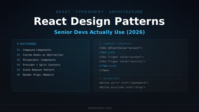
These are the six patterns that actually show up in production codebases.
1. Compound Components
The most important pattern for building flexible, composable UI components. Compound components share implicit state between a parent and a set of child components — the parent manages state, children consume it through context.
The canonical example is every accessible component library: Radix, Headless UI, shadcn/ui. Their <Select>, <Dialog>, and <Accordion> all use compound components internally.
The problem it solves: prop drilling and prop explosion. Instead of:
// ❌ Prop explosion — the parent knows too much
<Tabs
  items={tabs}
  activeTab={activeTab}
  onTabChange={setActiveTab}
  tabClassName="..."
  panelClassName="..."
  indicatorClassName="..."
/>
You get:
// ✅ Compound — each piece is independently controllable
<Tabs defaultValue="account">
  <Tabs.List>
    <Tabs.Trigger value="account">Account</Tabs.Trigger>
    <Tabs.Trigger value="security">Security</Tabs.Trigger>
  </Tabs.List>
  <Tabs.Content value="account"><AccountSettings /></Tabs.Content>
  <Tabs.Content value="security"><SecuritySettings /></Tabs.Content>
</Tabs>
Implementation:
import { createContext, useContext, useState, ReactNode } from 'react'

// 1. Define the shared state type
type TabsContextValue = {
  activeValue: string
  onChange: (value: string) => void
}

// 2. Create context
const TabsContext = createContext<TabsContextValue | null>(null)

function useTabs() {
  const ctx = useContext(TabsContext)
  if (!ctx) throw new Error('Tabs compound components must be used within <Tabs>')
  return ctx
}

// 3. Parent manages state, provides context
type TabsProps = {
  defaultValue: string
  value?: string
  onValueChange?: (value: string) => void
  children: ReactNode
}

function Tabs({ defaultValue, value, onValueChange, children }: TabsProps) {
  const [internalValue, setInternalValue] = useState(defaultValue)
  const activeValue = value ?? internalValue

  const onChange = (newValue: string) => {
    setInternalValue(newValue)
    onValueChange?.(newValue)
  }

  return (
    <TabsContext.Provider value={{ activeValue, onChange }}>
      <div className="w-full">{children}</div>
    </TabsContext.Provider>
  )
}

// 4. Children consume context
function TabsList({ children }: { children: ReactNode }) {
  return (
    <div role="tablist" className="flex border-b border-border">
      {children}
    </div>
  )
}

function TabsTrigger({ value, children }: { value: string; children: ReactNode }) {
  const { activeValue, onChange } = useTabs()
  const isActive = activeValue === value

  return (
    <button
      role="tab"
      aria-selected={isActive}
      onClick={() => onChange(value)}
      className={cn(
        'px-4 py-2 text-sm font-medium transition-colors',
        isActive
          ? 'border-b-2 border-primary text-foreground'
          : 'text-muted-foreground hover:text-foreground'
      )}
    >
      {children}
    </button>
  )
}

function TabsContent({ value, children }: { value: string; children: ReactNode }) {
  const { activeValue } = useTabs()
  if (activeValue !== value) return null
  return <div role="tabpanel" className="py-4">{children}</div>
}

// 5. Attach sub-components as static properties
Tabs.List = TabsList
Tabs.Trigger = TabsTrigger
Tabs.Content = TabsContent

export { Tabs }
The useTabs() guard — throwing when used outside the parent — catches misuse at runtime and gives a clear error message.
2. Custom Hooks as the Real Abstraction Layer
The shift that separates junior from senior React code: business logic lives in custom hooks, components are thin renderers.
The bad version: logic scattered in the component
// ❌ Component doing too much
function UserProfile({ userId }: { userId: string }) {
  const [user, setUser] = useState<User | null>(null)
  const [loading, setLoading] = useState(true)
  const [error, setError] = useState<string | null>(null)
  const [isEditing, setIsEditing] = useState(false)
  const [form, setForm] = useState({ name: '', email: '' })

  useEffect(() => {
    fetch(`/api/users/${userId}`)
      .then(r => r.json())
      .then(data => { setUser(data); setLoading(false) })
      .catch(e => { setError(e.message); setLoading(false) })
  }, [userId])

  async function handleSave() {
    await fetch(`/api/users/${userId}`, { method: 'PATCH', body: JSON.stringify(form) })
    setIsEditing(false)
  }

  // ... 80 more lines
}
The pattern: extract everything into a custom hook
// ✅ Hook owns the logic
function useUserProfile(userId: string) {
  const { data: user, isLoading, error } = useQuery({
    queryKey: ['user', userId],
    queryFn: () => fetchUser(userId),
  })

  const [isEditing, setIsEditing] = useState(false)
  const form = useForm<UserFormValues>({
    resolver: zodResolver(userSchema),
    values: user ? { name: user.name ?? '', email: user.email } : undefined,
  })

  const updateUser = useMutation({
    mutationFn: (data: UserFormValues) => patchUser(userId, data),
    onSuccess: (updated) => {
      queryClient.setQueryData(['user', userId], updated)
      setIsEditing(false)
      toast.success('Profile updated')
    },
  })

  return {
    user,
    isLoading,
    error,
    isEditing,
    form,
    startEditing: () => setIsEditing(true),
    cancelEditing: () => { setIsEditing(false); form.reset() },
    saveUser: form.handleSubmit((data) => updateUser.mutate(data)),
    isSaving: updateUser.isPending,
  }
}

// ✅ Component is a thin renderer
function UserProfile({ userId }: { userId: string }) {
  const {
    user, isLoading, isEditing, form,
    startEditing, cancelEditing, saveUser, isSaving,
  } = useUserProfile(userId)

  if (isLoading) return <UserProfileSkeleton />
  if (!user) return <NotFound />

  return isEditing
    ? <UserEditForm form={form} onSave={saveUser} onCancel={cancelEditing} isSaving={isSaving} />
    : <UserDisplay user={user} onEdit={startEditing} />
}
The hook is independently testable. The component becomes straightforward enough that anyone on the team can modify it without understanding the data fetching logic.
3. Polymorphic Components
A button that needs to render as <a> on some pages and <button> on others. A card that's sometimes a <div>, sometimes a <Link>. The polymorphic pattern handles this while keeping full TypeScript inference:
import { ElementType, ComponentPropsWithoutRef, ReactNode } from 'react'

// The magic: As extends ElementType (any HTML element or React component)
type PolymorphicProps<As extends ElementType> = {
  as?: As
  children?: ReactNode
  className?: string
} & Omit<ComponentPropsWithoutRef<As>, 'as' | 'children' | 'className'>

function Button<As extends ElementType = 'button'>({
  as,
  className,
  children,
  ...rest
}: PolymorphicProps<As>) {
  const Component = as ?? 'button'

  return (
    <Component
      className={cn(
        'inline-flex items-center justify-center rounded-md px-4 py-2 text-sm font-medium',
        'bg-primary text-primary-foreground hover:bg-primary/90',
        'disabled:pointer-events-none disabled:opacity-50',
        className
      )}
      {...rest}
    >
      {children}
    </Component>
  )
}
Usage — TypeScript enforces the correct props for each element:
// Renders as <button> — TypeScript knows onClick, type, disabled, etc.
<Button onClick={handleSubmit}>Submit</Button>

// Renders as <a> — TypeScript knows href, target, rel, etc.
<Button as="a" href="/dashboard">Go to dashboard</Button>

// Renders as Next.js Link — TypeScript knows href is required
<Button as={Link} href="/blog">Read the blog</Button>

// TypeScript error: 'href' is not valid on <button>
<Button href="/wrong">This breaks</Button>
4. Provider Pattern with a Custom Hook Gate
Context is commonly misused: providers scattered across the tree, consumers calling useContext directly without checking for null, or context being used for state that changes too frequently (causing unnecessary re-renders).
The provider pattern done right:
// 1. Typed context with explicit null
type AuthContextValue = {
  user: User | null
  isLoading: boolean
  signOut: () => Promise<void>
}

const AuthContext = createContext<AuthContextValue | undefined>(undefined)

// 2. Custom hook that guards against usage outside the provider
export function useAuth() {
  const ctx = useContext(AuthContext)
  if (ctx === undefined) {
    throw new Error('useAuth must be used within an AuthProvider')
  }
  return ctx
}

// 3. Provider handles all the logic
export function AuthProvider({ children }: { children: ReactNode }) {
  const [user, setUser] = useState<User | null>(null)
  const [isLoading, setIsLoading] = useState(true)

  useEffect(() => {
    getSession().then((session) => {
      setUser(session?.user ?? null)
      setIsLoading(false)
    })
  }, [])

  async function signOut() {
    await clearSession()
    setUser(null)
  }

  return (
    <AuthContext.Provider value={{ user, isLoading, signOut }}>
      {children}
    </AuthContext.Provider>
  )
}
Split contexts to avoid unnecessary re-renders: if user changes rarely but isLoading changes often, separate them:
const AuthUserContext = createContext<User | null>(null)
const AuthActionsContext = createContext<{ signOut: () => void } | null>(null)

// Components that only need the actions don't re-render when user changes
export const useAuthUser = () => useContext(AuthUserContext)
export const useAuthActions = () => {
  const ctx = useContext(AuthActionsContext)
  if (!ctx) throw new Error('useAuthActions must be inside AuthProvider')
  return ctx
}
5. State Reducer Pattern
The state reducer pattern lets consumers override internal state transitions without the component library having to anticipate every use case. It's how Downshift and React Query expose customization.
Use case: a multi-select dropdown that normally closes when an item is selected, but for this specific usage should stay open:
type MultiSelectState = {
  isOpen: boolean
  selectedItems: string[]
  searchValue: string
}

type MultiSelectAction =
  | { type: 'toggle_item'; item: string }
  | { type: 'open' }
  | { type: 'close' }
  | { type: 'search'; value: string }

function defaultReducer(state: MultiSelectState, action: MultiSelectAction): MultiSelectState {
  switch (action.type) {
    case 'toggle_item': {
      const exists = state.selectedItems.includes(action.item)
      return {
        ...state,
        selectedItems: exists
          ? state.selectedItems.filter((i) => i !== action.item)
          : [...state.selectedItems, action.item],
        isOpen: false,  // default: close on select
      }
    }
    case 'open': return { ...state, isOpen: true }
    case 'close': return { ...state, isOpen: false, searchValue: '' }
    case 'search': return { ...state, searchValue: action.value }
    default: return state
  }
}

type MultiSelectProps = {
  items: string[]
  onChange?: (selected: string[]) => void
  // The escape hatch: override any state transition
  stateReducer?: (state: MultiSelectState, action: MultiSelectAction) => MultiSelectState
}

function MultiSelect({ items, onChange, stateReducer }: MultiSelectProps) {
  const [state, dispatch] = useReducer(
    (state: MultiSelectState, action: MultiSelectAction) => {
      const newState = defaultReducer(state, action)
      // Allow consumer to override the final state
      return stateReducer ? stateReducer(newState, action) : newState
    },
    { isOpen: false, selectedItems: [], searchValue: '' }
  )

  // ... render
}
Consumer overrides only what they need:
// Stay open after selecting an item
<MultiSelect
  items={options}
  stateReducer={(newState, action) => {
    if (action.type === 'toggle_item') {
      return { ...newState, isOpen: true }  // override: keep open
    }
    return newState
  }}
/>
6. Render Props (Modern Version)
Render props fell out of fashion when hooks arrived, but the pattern is still valid for cases where a component needs to expose its internal state to its children with different rendering in each context:
type DataTableRenderProps<T> = {
  rows: T[]
  isLoading: boolean
  selectedRows: T[]
  sortConfig: SortConfig | null
  onSort: (key: keyof T) => void
  onRowSelect: (row: T) => void
}

type DataTableProps<T> = {
  data: T[]
  fetchData: (params: FetchParams) => Promise<{ rows: T[]; total: number }>
  children: (props: DataTableRenderProps<T>) => ReactNode
  // or: render?: (props: DataTableRenderProps<T>) => ReactNode
}

function DataTable<T>({ data, fetchData, children }: DataTableProps<T>) {
  const [rows, setRows] = useState(data)
  const [isLoading, setIsLoading] = useState(false)
  const [selectedRows, setSelectedRows] = useState<T[]>([])
  const [sortConfig, setSortConfig] = useState<SortConfig | null>(null)

  // ... sort and selection logic

  return <>{children({ rows, isLoading, selectedRows, sortConfig, onSort, onRowSelect })}</>
}

// Usage — caller controls the rendering
<DataTable data={users} fetchData={fetchUsers}>
  {({ rows, isLoading, selectedRows, onSort }) => (
    <div>
      {selectedRows.length > 0 && (
        <BulkActions selected={selectedRows} />
      )}
      <table>
        <thead>
          <tr>
            <SortableHeader onClick={() => onSort('name')}>Name</SortableHeader>
            <SortableHeader onClick={() => onSort('email')}>Email</SortableHeader>
          </tr>
        </thead>
        <tbody>
          {isLoading
            ? <TableSkeleton />
            : rows.map(row => <UserRow key={row.id} user={row} />)
          }
        </tbody>
      </table>
    </div>
  )}
</DataTable>
The render prop approach makes sense when a hook isn't enough — specifically when the component manages DOM interactions that need to be tied to specific elements in the consumer's markup.
Which Pattern for Which Problem
| Problem | Pattern |
|---|---|
| Complex component with multiple related sub-parts | Compound Components |
| Business logic reuse across components | Custom Hook |
| Component that renders different HTML elements | Polymorphic Component |
| Global state with selective re-renders | Provider + split contexts |
| Library that exposes flexible state override | State Reducer |
| Component that controls logic but not markup | Render Props |
These patterns aren't mutually exclusive. A compound component might use the state reducer internally to let consumers customize state transitions. A custom hook might use the provider pattern underneath. Real codebases mix them based on what the problem actually requires — not based on which pattern sounds most sophisticated. Start with the simplest solution, reach for these when the simpler version breaks down.