The library formerly known as Framer Motion is now just motion — same team, same API, leaner package. The patterns that were experimental in v10 are now stable, and the scroll-driven animation APIs in particular have become the standard way to build anything that reacts to scroll position.
Most animation tutorials show a spinning box. This guide shows the patterns you actually reach for: exit animations, shared layout transitions, scroll-driven effects, stagger lists, and gesture interactions — all with the code you can drop into a real project.
Installation
# The new package name (v11+)
npm install motion

# framer-motion still works and re-exports from motion
npm install framer-motion
Imports work with either package name:
import { motion, AnimatePresence } from 'motion/react'
// or
import { motion, AnimatePresence } from 'framer-motion'
The motion Component
Every HTML element has a motion equivalent. It accepts initial, animate, and exit props:
import { motion } from 'motion/react'

// Fade in on mount
<motion.div
  initial={{ opacity: 0, y: 20 }}
  animate={{ opacity: 1, y: 0 }}
  transition={{ duration: 0.4, ease: 'easeOut' }}
>
  Content
</motion.div>
initial — the starting state (before mounting or before animation)
animate — the target state
transition — how to get there (duration, easing, spring parameters)
Variants: Cleaner Animation Definitions
Instead of inline objects, define named states with variants. Child components inherit and can orchestrate their animations relative to the parent:
const containerVariants = {
  hidden: { opacity: 0 },
  visible: {
    opacity: 1,
    transition: {
      staggerChildren: 0.08, // children animate 80ms apart
    },
  },
}

const itemVariants = {
  hidden: { opacity: 0, y: 16 },
  visible: {
    opacity: 1,
    y: 0,
    transition: { duration: 0.35, ease: [0.25, 0.46, 0.45, 0.94] },
  },
}

function AnimatedList({ items }: { items: string[] }) {
  return (
    <motion.ul
      variants={containerVariants}
      initial="hidden"
      animate="visible"
    >
      {items.map((item) => (
        <motion.li key={item} variants={itemVariants}>
          {item}
        </motion.li>
      ))}
    </motion.ul>
  )
}
The staggerChildren in the container's transition staggers each child's visible animation automatically. No manual delay calculation.
AnimatePresence: Exit Animations
React unmounts components instantly — there's no hook for "just before unmounting." AnimatePresence intercepts this and lets the exit prop animate before the component leaves the DOM:
import { motion, AnimatePresence } from 'motion/react'
import { useState } from 'react'

function Toast({ message }: { message: string }) {
  return (
    <motion.div
      initial={{ opacity: 0, x: 100 }}
      animate={{ opacity: 1, x: 0 }}
      exit={{ opacity: 0, x: 100 }}
      transition={{ type: 'spring', stiffness: 300, damping: 30 }}
      className="rounded-lg bg-foreground px-4 py-3 text-background shadow-lg"
    >
      {message}
    </motion.div>
  )
}

function ToastContainer() {
  const [toasts, setToasts] = useState<{ id: number; message: string }[]>([])

  return (
    <div className="fixed bottom-4 right-4 flex flex-col gap-2">
      <AnimatePresence>
        {toasts.map((toast) => (
          <Toast key={toast.id} message={toast.message} />
        ))}
      </AnimatePresence>
    </div>
  )
}
AnimatePresence must wrap the conditional or list. The key prop is what lets it track which elements entered and exited.
mode="wait" for single-component transitions
When switching between two components (tabs, pages), use mode="wait" to wait for the exiting component to finish before the entering one starts:
function TabContent({ tab }: { tab: 'overview' | 'settings' }) {
  return (
    <AnimatePresence mode="wait">
      <motion.div
        key={tab}
        initial={{ opacity: 0, x: -8 }}
        animate={{ opacity: 1, x: 0 }}
        exit={{ opacity: 0, x: 8 }}
        transition={{ duration: 0.2 }}
      >
        {tab === 'overview' ? <Overview /> : <Settings />}
      </motion.div>
    </AnimatePresence>
  )
}
Spring Physics
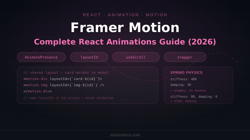
Springs feel more natural than duration-based easing because they mimic physical behavior. Instead of duration, configure stiffness and damping:
// Tight, snappy spring
<motion.div
  animate={{ x: 100 }}
  transition={{ type: 'spring', stiffness: 400, damping: 30 }}
/>

// Bouncy spring
<motion.div
  animate={{ scale: 1.1 }}
  transition={{ type: 'spring', stiffness: 200, damping: 10 }}
/>

// Slow, gentle spring (like a heavy object)
<motion.div
  animate={{ y: 40 }}
  transition={{ type: 'spring', stiffness: 80, damping: 20 }}
/>
Rule of thumb:
- High stiffness + high damping → snappy, no bounce
- Low stiffness + low damping → slow, bouncy
massincreases inertia (heavier object, slower to start and stop)
Layout Animations
The layout prop makes Motion animate between different layout positions automatically. When the component's position or size changes (due to CSS, parent changes, conditional rendering), Motion detects the difference and animates between the old and new positions:
function FilterableList({ items }: { items: Item[] }) {
  const [filter, setFilter] = useState('all')
  const filtered = items.filter(item =>
    filter === 'all' || item.category === filter
  )

  return (
    <>
      <FilterButtons value={filter} onChange={setFilter} />
      <ul className="flex flex-wrap gap-3">
        <AnimatePresence>
          {filtered.map((item) => (
            <motion.li
              key={item.id}
              layout           // ← animates position changes
              initial={{ opacity: 0, scale: 0.8 }}
              animate={{ opacity: 1, scale: 1 }}
              exit={{ opacity: 0, scale: 0.8 }}
              transition={{ type: 'spring', stiffness: 300, damping: 25 }}
            >
              <ItemCard item={item} />
            </motion.li>
          ))}
        </AnimatePresence>
      </ul>
    </>
  )
}
When the filter changes, remaining items smoothly reposition instead of jumping.
Shared Layout: layoutId
layoutId is the most impressive Motion feature: elements with the same layoutId animate between each other's positions even if they're different components in different parts of the tree.
Classic use case — expanding a card to a modal:
function GalleryCard({ image, onClick }: { image: Image; onClick: () => void }) {
  return (
    <motion.div layoutId={`card-${image.id}`} onClick={onClick} className="cursor-pointer">
      <motion.img layoutId={`img-${image.id}`} src={image.src} className="w-full rounded-lg" />
      <motion.h3 layoutId={`title-${image.id}`}>{image.title}</motion.h3>
    </motion.div>
  )
}

function ExpandedCard({ image, onClose }: { image: Image; onClose: () => void }) {
  return (
    <motion.div
      layoutId={`card-${image.id}`}
      className="fixed inset-4 z-50 flex flex-col rounded-2xl bg-white shadow-2xl"
    >
      <motion.img layoutId={`img-${image.id}`} src={image.src} className="h-64 object-cover" />
      <motion.h3 layoutId={`title-${image.id}`} className="p-6 text-2xl font-bold">
        {image.title}
      </motion.h3>
      <button onClick={onClose}>Close</button>
    </motion.div>
  )
}

function Gallery() {
  const [selected, setSelected] = useState<Image | null>(null)

  return (
    <>
      <div className="grid grid-cols-3 gap-4">
        {images.map((image) => (
          <GalleryCard key={image.id} image={image} onClick={() => setSelected(image)} />
        ))}
      </div>

      <AnimatePresence>
        {selected && (
          <>
            <motion.div
              className="fixed inset-0 bg-black/50"
              initial={{ opacity: 0 }}
              animate={{ opacity: 1 }}
              exit={{ opacity: 0 }}
              onClick={() => setSelected(null)}
            />
            <ExpandedCard image={selected} onClose={() => setSelected(null)} />
          </>
        )}
      </AnimatePresence>
    </>
  )
}
The card morphs from its grid position to the expanded modal position. No position calculation needed.
Scroll-Driven Animations
useScroll returns scroll progress values you can transform into any animated property:
import { motion, useScroll, useTransform } from 'motion/react'
import { useRef } from 'react'

function ParallaxHero() {
  const ref = useRef<HTMLDivElement>(null)
  const { scrollYProgress } = useScroll({
    target: ref,
    offset: ['start start', 'end start'],
  })

  // As the section scrolls from 0% to 100% into the viewport:
  const y = useTransform(scrollYProgress, [0, 1], ['0%', '30%'])    // parallax
  const opacity = useTransform(scrollYProgress, [0, 0.5], [1, 0])    // fade out

  return (
    <div ref={ref} className="relative h-[80vh] overflow-hidden">
      <motion.div
        style={{ y, opacity }}
        className="absolute inset-0 bg-gradient-to-b from-blue-900 to-purple-900"
      />
      <motion.h1
        style={{ y: useTransform(scrollYProgress, [0, 1], ['0%', '50%']) }}
        className="relative z-10 text-6xl font-black text-white"
      >
        Welcome
      </motion.h1>
    </div>
  )
}
useInView: Animate on scroll into view
import { motion, useInView } from 'motion/react'
import { useRef } from 'react'

function AnimateOnScroll({ children }: { children: React.ReactNode }) {
  const ref = useRef<HTMLDivElement>(null)
  const isInView = useInView(ref, {
    once: true,  // only trigger once, not on scroll back
    margin: '-100px 0px', // trigger 100px before element enters viewport
  })

  return (
    <motion.div
      ref={ref}
      initial={{ opacity: 0, y: 40 }}
      animate={isInView ? { opacity: 1, y: 0 } : { opacity: 0, y: 40 }}
      transition={{ duration: 0.6, ease: [0.25, 0.46, 0.45, 0.94] }}
    >
      {children}
    </motion.div>
  )
}
Gesture Animations
Interactive hover, tap, and drag states:
function InteractiveCard({ children }: { children: React.ReactNode }) {
  return (
    <motion.div
      whileHover={{ scale: 1.02, y: -4 }}
      whileTap={{ scale: 0.98 }}
      transition={{ type: 'spring', stiffness: 400, damping: 17 }}
      className="cursor-pointer rounded-xl border bg-card p-6 shadow-sm"
    >
      {children}
    </motion.div>
  )
}

// Draggable element
function DraggableChip({ label }: { label: string }) {
  return (
    <motion.div
      drag
      dragConstraints={{ left: -50, right: 50, top: -20, bottom: 20 }}
      dragElastic={0.2}
      whileDrag={{ scale: 1.05, cursor: 'grabbing' }}
      className="cursor-grab rounded-full bg-primary px-4 py-2 text-primary-foreground"
    >
      {label}
    </motion.div>
  )
}
SVG Path Animations
Animate SVG paths drawing themselves:
function AnimatedCheckmark() {
  return (
    <svg viewBox="0 0 52 52" className="h-16 w-16">
      {/* Circle */}
      <motion.circle
        cx="26"
        cy="26"
        r="25"
        fill="none"
        stroke="currentColor"
        strokeWidth="2"
        initial={{ pathLength: 0 }}
        animate={{ pathLength: 1 }}
        transition={{ duration: 0.6, ease: 'easeOut' }}
      />
      {/* Checkmark */}
      <motion.path
        d="M14 27 L21 34 L38 17"
        fill="none"
        stroke="currentColor"
        strokeWidth="3"
        strokeLinecap="round"
        initial={{ pathLength: 0 }}
        animate={{ pathLength: 1 }}
        transition={{ duration: 0.4, delay: 0.5, ease: 'easeOut' }}
      />
    </svg>
  )
}
Keyframes
Animate through multiple values with an array:
<motion.div
  animate={{
    x: [0, 30, -30, 30, 0],     // bounce left-right
    rotate: [0, 10, -10, 10, 0],
  }}
  transition={{
    duration: 0.8,
    ease: 'easeInOut',
  }}
/>
useAnimate: Imperative Animations
For animations that need to be triggered by events (not just on mount), or chained sequences:
import { useAnimate } from 'motion/react'

function SubmitButton() {
  const [scope, animate] = useAnimate()

  async function handleClick() {
    // Sequence: scale down → wait → scale back → move right
    await animate(scope.current, { scale: 0.95 }, { duration: 0.1 })
    await animate(scope.current, { scale: 1 }, { duration: 0.1 })

    const success = await submitForm()

    if (success) {
      await animate(scope.current, { x: 200, opacity: 0 }, { duration: 0.4 })
    } else {
      // Shake on error
      await animate(scope.current, { x: [-8, 8, -8, 8, 0] }, { duration: 0.4 })
    }
  }

  return (
    <motion.button ref={scope} onClick={handleClick}>
      Submit
    </motion.button>
  )
}
Performance
Motion automatically uses CSS transforms and will-change to hardware-accelerate animations. But some properties can't be GPU-accelerated:
// ✅ GPU-accelerated — performant
animate={{ x: 100, y: 50, scale: 1.1, rotate: 45, opacity: 0.8 }}

// ❌ Triggers layout recalculation — avoid animating these
animate={{ width: 200, height: 100, padding: 20, margin: 10 }}

// ✅ If you need size animation, use scaleX/scaleY instead
animate={{ scaleX: 1.5 }}
For complex animations on lower-end devices, use useReducedMotion to respect the user's preference:
import { useReducedMotion } from 'motion/react'

function AnimatedBanner() {
  const shouldReduceMotion = useReducedMotion()

  return (
    <motion.div
      initial={{ opacity: 0, y: shouldReduceMotion ? 0 : 40 }}
      animate={{ opacity: 1, y: 0 }}
      transition={{ duration: shouldReduceMotion ? 0.01 : 0.6 }}
    >
      Content
    </motion.div>
  )
}
Quick Reference
// Basic animation
<motion.div initial={{ opacity: 0 }} animate={{ opacity: 1 }} exit={{ opacity: 0 }} />

// Spring physics
transition={{ type: 'spring', stiffness: 300, damping: 25 }}

// Stagger children via variants
const container = { hidden: {}, visible: { transition: { staggerChildren: 0.08 } } }

// Exit animations — wrap with AnimatePresence
<AnimatePresence mode="wait"><motion.div key={id} exit={{ opacity: 0 }} /></AnimatePresence>

// Shared layout transition
<motion.div layoutId="card" /> // same layoutId in two places = morph animation

// Scroll-driven
const { scrollYProgress } = useScroll({ target: ref })
const opacity = useTransform(scrollYProgress, [0, 1], [1, 0])
<motion.div style={{ opacity }} />

// Scroll into view
const isInView = useInView(ref, { once: true })
<motion.div animate={isInView ? 'visible' : 'hidden'} />

// Gestures
<motion.div whileHover={{ scale: 1.05 }} whileTap={{ scale: 0.95 }} />

// Respect reduced motion
const shouldReduce = useReducedMotion()
The patterns that make the biggest difference in practice: AnimatePresence for any conditional rendering, layoutId for anything that morphs between states, and useInView for scroll-triggered reveals. Most other animation needs are covered by whileHover/whileTap for interactivity and staggerChildren for list entrances.